This colour will inevitably take hold, turning up in everything from product packaging to interior design. But who are Pantone to call it, and, more importantly, should we care? We sat down with Art Director Dasha Tofanchuk to chat colour, creativity, and chameleons.
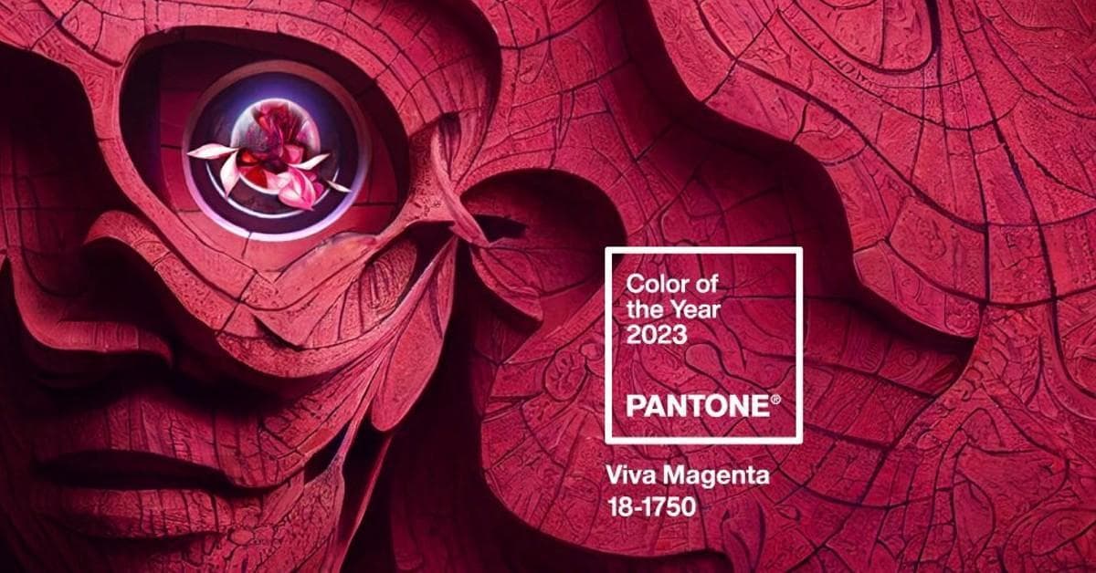
In 2000, the Pantone Colour Institute began selecting a Colour of the Year, the result of analysing global lifestyle trends and cultural moments across the world which now creates a pop cultural moment at the end of each calendar year. In December 2022, 2023’s colour was announced: Viva Magenta. It is “brave and fearless, a pulsating colour whose exuberance promotes a joyous and optimistic celebration.”

Source: Twitter
So, amongst war and political extremism and rising mortgage rates and whatever nasal spray tans are, does this sound like the zeitgeist right now?
The Pantone pick inevitably creates a stir among designers and colour enthusiasts, and prompts the widespread creation of mood boards, montages, and editorial selections each year.
Colour trends emerge from areas well beyond graphic design, of course. Consider the dialogue around “quiet luxury” and its neutral colours that emerged during Succession, or the influence of White Lotus on interior design. Art collections, up-and-coming fashion designers and modish travel destinations are equally influential on colour trends.
Beyond art, design and lifestyle are the influences of socio-economic conditions, technological advancements and even sporting events. The colour of uniforms worn by athletes during the FIFA Women’s World Cup, for example, may well inspire new styling or colour combinations in upcoming design choices.
When it comes to colours for brand identity though, should we bother gazing into the crystal ball of colours or track the endless emergence of new trends? Our Art Director Dasha Tofanchuk talks us through her approach to colour trends and why in general, colour matters so much in effective creative work.
Q: How important is colour to a brand identity?
A: Colour beats at the core of a brand, weaving a powerful tapestry of emotions – it can create love, hate, trust, avoidance, and belief in a brand. It wields an artful wizardry, compelling us to buy, to adore, and even to advocate for a brand. Yearn for smiles when people glimpse your brand? Let the sunlit charm of yellow work its magic!
Q: Can you give a favourite example of excellent colour use?
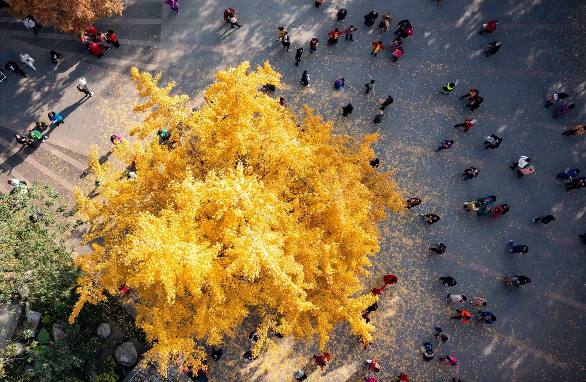
A: Look no further than nature's vivid canvas. Mother Earth displays the most awe-inspiring colour combinations, and beauty certainly lies in the eyes of the beholder.

Source: National Geographic (2023) https://www.nationalgeographic.com/
Q: At what point does colour come into your creative process?
A: Colour is an eternal companion, etched in our visual existence from the day we first open our eyes. From that moment we embark on an inescapable journey through life's kaleidoscope of hues and shades.
As part of the creative process I can draw on the long-stored associations humans have with certain colours. For example, the resurgence of rich, jewel-like colours from the 90s presents an exciting opportunity for an art director. These colours can evoke a sense of nostalgia while also feeling fresh and vibrant in a contemporary context.
If on-trend colours resonate with the brand's image and personality, incorporating them (thoughtfully!) can enhance the visual appeal and relevance of my work, making it more relatable to the intended viewers or consumers. However, it's crucial to strike a balance between following trends and maintaining a timeless quality in my designs.
Q: Do colour trends matter in your work? Should we pay attention to them?
A: Emphatically, yes! Colour trends do matter in the realm of design and branding, and paying attention to them can be highly beneficial. As an art director, it's essential to stay attuned to the ever-changing preferences and tastes of my client's target audience.
Being overly reliant on trends, however, can lead to generic and predictable designs that might not leave a lasting impact on an audience. I strive to infuse my work with an artistic vision, using colour trends as a tool to enhance my message rather than as a crutch to rely on.
And colour trends are not limited to specific industries; they can be seen across various design disciplines, such as interior design, fashion, and game design. As a creative, being aware of these cross-industry trends can inspire and allow me to create innovative designs that align with current consumer preferences.
On the whole, embracing colour trends can be powerful. But it's equally important to exercise creativity and adapt them in unique ways.
Q: We all have our preferences and biases when it comes to colour -- do you suppress yours or just lean into what you like?
A: In my private realm, I've developed a soft spot for the offbeat and the alternative, shunning the plain primary tones. However, in the professional arena, neutrality reigns supreme. Colour plays the chameleon, adapting effortlessly to each client's unique narrative.


